 Netflix
We're willing to bet we are not the only ones who don't skip through the opening credits of Stranger Things. This is a big deal, considering how annoying a title sequence can get while trying to binge watch shows like Friends or Sex and the City (GROAN). Maybe we're just biased because there aren't nearly as many episodes, and therefore opening credits to sit through, to get annoyed with them just yet.
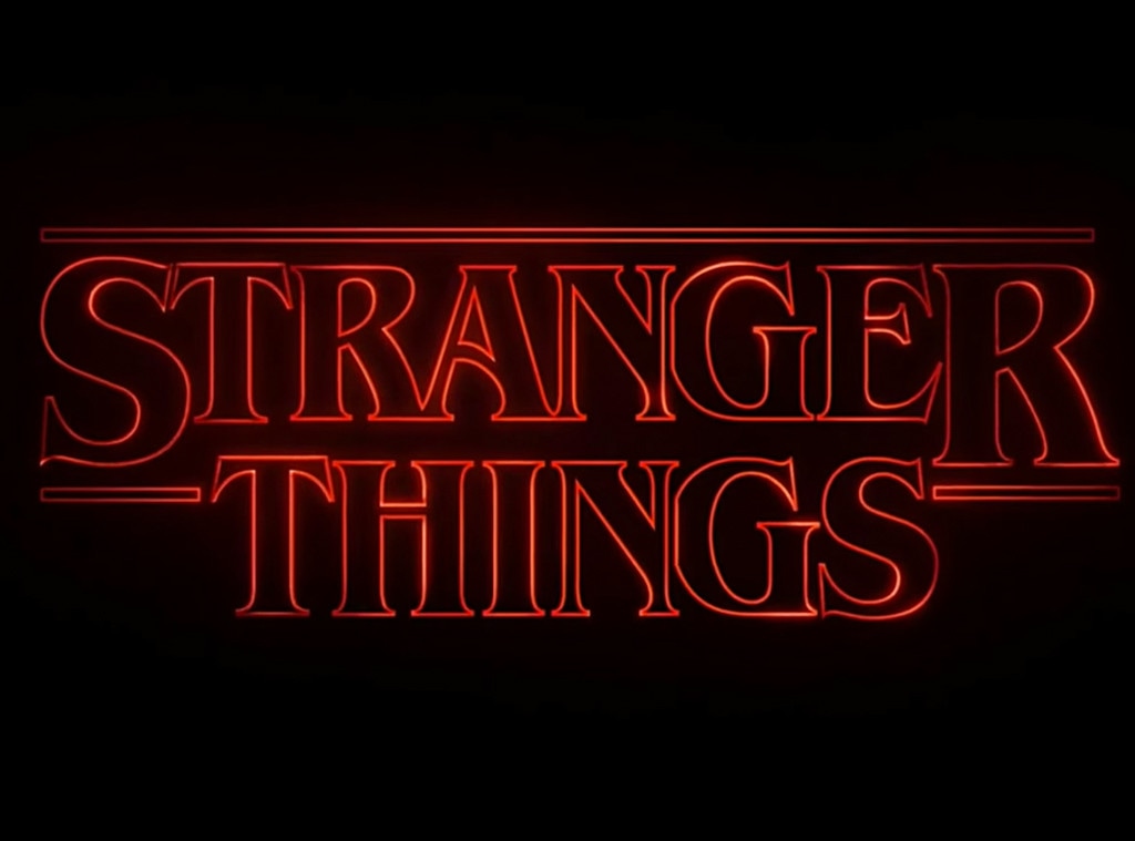
Even if you do skip over them, you have to admit, those glowing red letters, mixed with that haunting music, is pretty freaking cool. If you've ever seen an '80s movie or vintage book cover, you'll totally get where the Duffer Brothers drew their inspiration.
ST nerds will totally appreciate this video, made by Vox, which uncovers just how the red and black logo was developed. Imaginary Forces, the studio that helped the show create its vintage title sequence, is also responsible for the opening credits of Mad Men, Late Night With Seth Meyers and many more of your favorites.
Did you know that the T-shirt-worthy logo was created using both physical and digital effects? In other words, the creators used old school film methods mixed with modern day digital effects to create an attention-grabbing sequence. The clip takes you through the evolution of the logo, including mock-ups of designs that got rejected. If we're being honest, some of them were far from chic. If you're into design, or just have a good eye, you'll recognize the Stranger Things typeface from the Choose Your Own Adventure books. No kidding, right? Hooray for nostalgia!